BRANDING
PACKAGING
ILLUSTRATION
Forgotten Fruits
BRANDING PACKAGING ILLUSTRATION
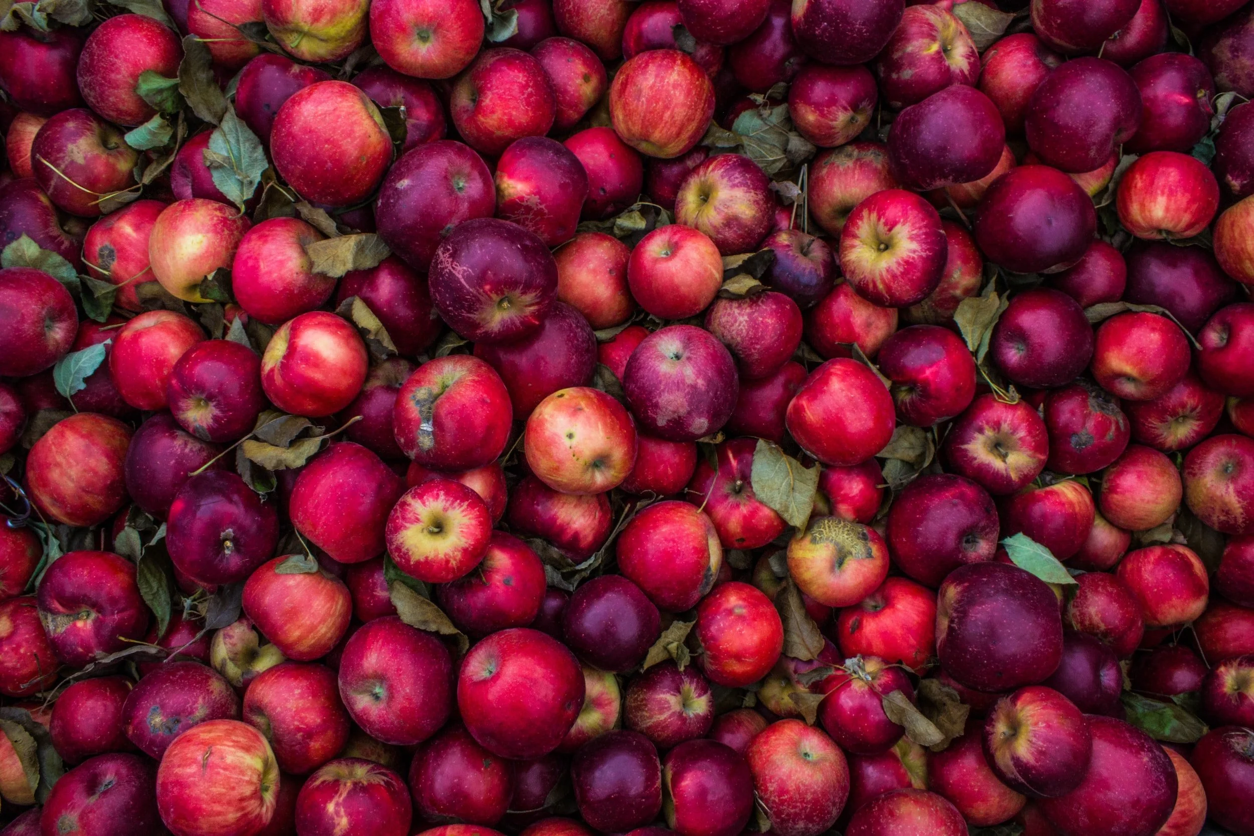
Forgotten Fruits is a theoretical specialty food brand dedicated to feeding people, not landfills. Partnering with local grocery stores, farms, and food manufacturers in the greater Philadelphia area, they aim to help tackle food excess and give purpose to forgotten produce by redistributing it as preserved products such as jams, juices, and candies.
INSTRUCTOR - KATEY STAFFORD
PROBLEM AND POTENTIAL SOLUTION
Food waste is raging in America. Approximately 40% of all food produced is thrown away. A lot of this waste occurs at the root of the food system: where it is produced and sold. In other words, a lot of the food produced in America doesn’t have a chance to make it to people’s homes; it doesn’t even make it to the shelves. Forgotten Fruits was born out of a fascination with dumpster diving culture and its efforts to impact food waste. The food would be redistributed as preserved goods for maximum food-saving potential because they have a longer shelf life.
Images from Unsplash LOGO
I drew a lot of inspiration from 50’s vintage packaging with my initial sketches. I thought this was a great place to start because many farm stands and produce markets in my area tend to embrace a more vintage feel, and I wanted to emphasize that feeling in Forgotten Fruits.
PRODUCTS
I still wanted to embrace the vintage farm feeling, but at this point, I had changed my mood board a bit to include more inspiration from Art Nouveau. This period in art is categorized by frames crowded with imagery of nature and abundance. I decided that using a style inspired by Art Nouveau would bring a deeper meaning to the mission behind my products, as it would emphasize that they were created using overproduced food. I designed labels with slightly crowded illustrations highlighting repetition and reflection to make this style.
COLLATERAL
Finally, the collateral came into the picture to pull the brand together and make it feel cohesive and alive. For collateral, I included a shipping box, reusable canvas shopping bags, and product recipe cards. At this point, much of the brand design felt set as the illustration style, colors, and mood were figured out. All that was left to do was to put these elements together on each piece of collateral in a way that kept the imagery fresh but made sense for the brand. I played around a lot with different layouts and content types here to ensure I was happy with the final products.
FINAL DESIGNS


